
tufte-data-viz
An agent skill that applies Edward Tufte's data visualization principles when generating charts, plots, and graphs. Produces clean, honest, high-data-ink-ratio visualizations across multiple charting libraries — extended with modern screen-first standards for accessibility, responsiveness, and interactivity.
Fair warning
This skill is opinionated by design. It will remove your gridlines, delete your legends, reject your pie charts, and insist on serif fonts. It enforces a specific visual philosophy — Tufte's — not a neutral one. If you want total creative freedom over your chart styling, this is not the skill for you. If you want every chart to come out clean, honest, and readable without thinking about it, read on.
Install
npx skills add caylent/tufte-data-viz
Before & After
The same data, default styling vs. Tufte principles applied:
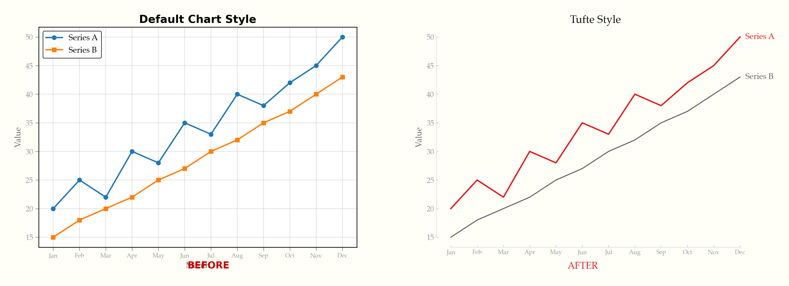
See it happen live — gridlines fade, legends become direct labels, chartjunk dissolves:
Interactive Demo
Try the live demo — toggle between default and Tufte styling across ECharts, Chart.js, Plotly, and D3.js. Includes dark mode.
Examples
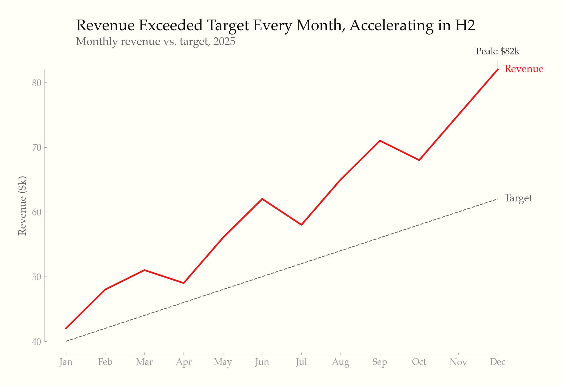
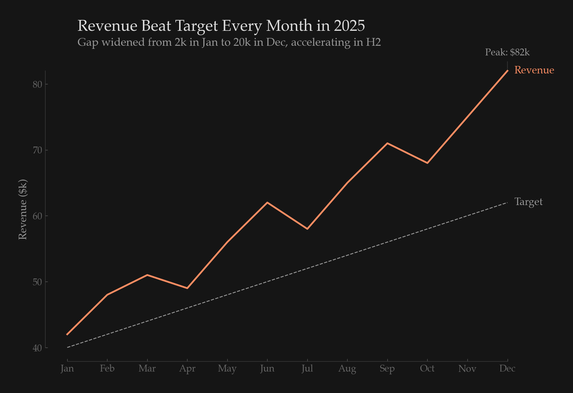
Line chart — direct labels, range-frame axes, annotation
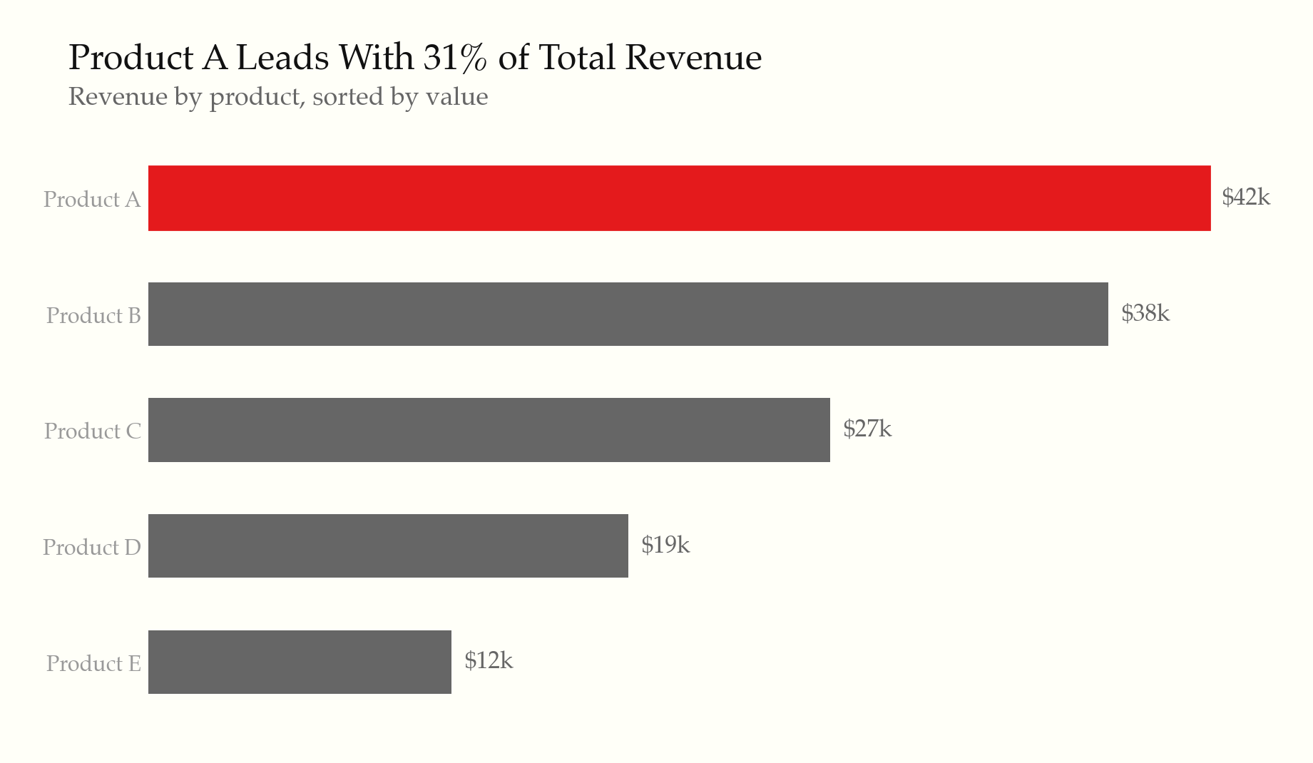
Horizontal bar chart — sorted by value, highlighted leader
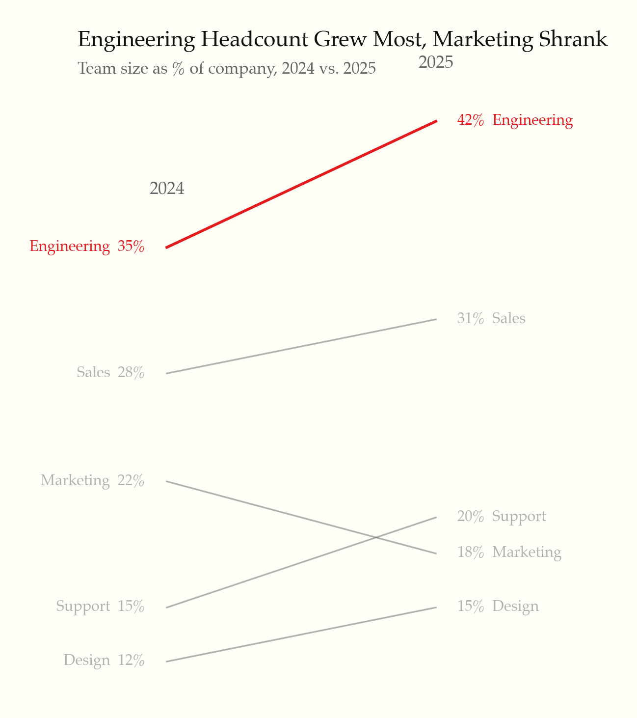
Slopegraph — before/after comparison
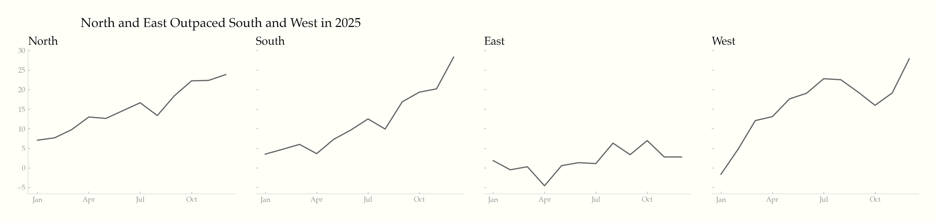
Small multiples — shared scale, minimal chrome
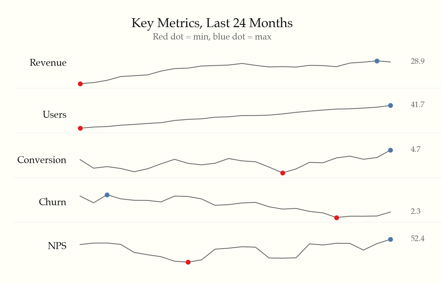
Sparklines — word-sized charts with min/max markers
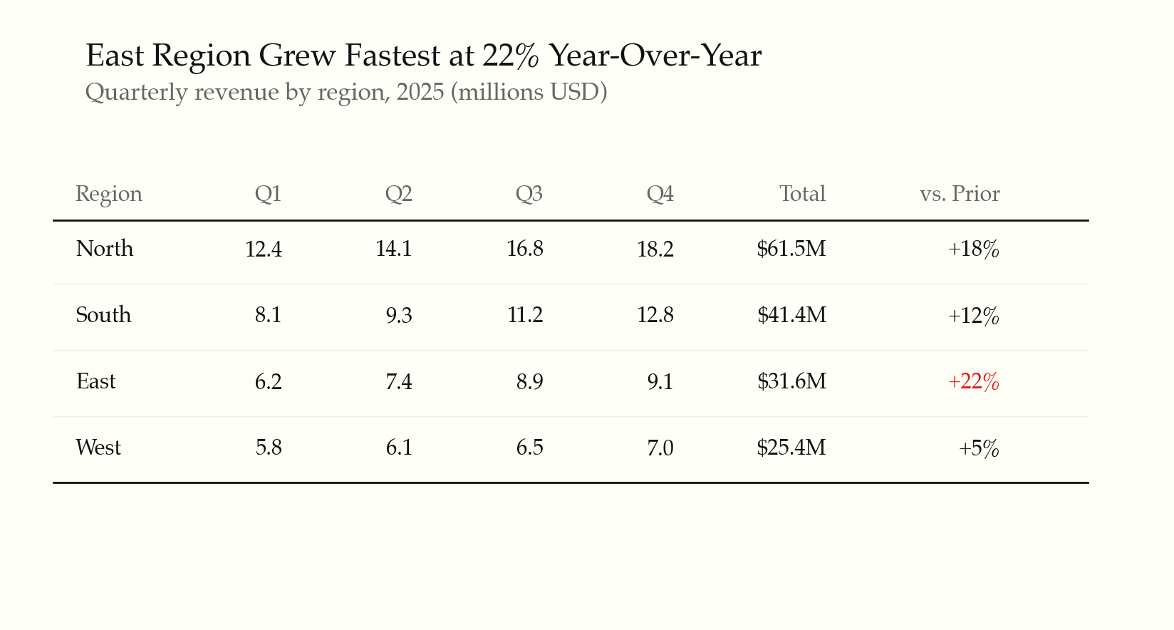
Data table — whitespace, thin rules, highlighted outlier
Dark mode — intentional palette, not inverted
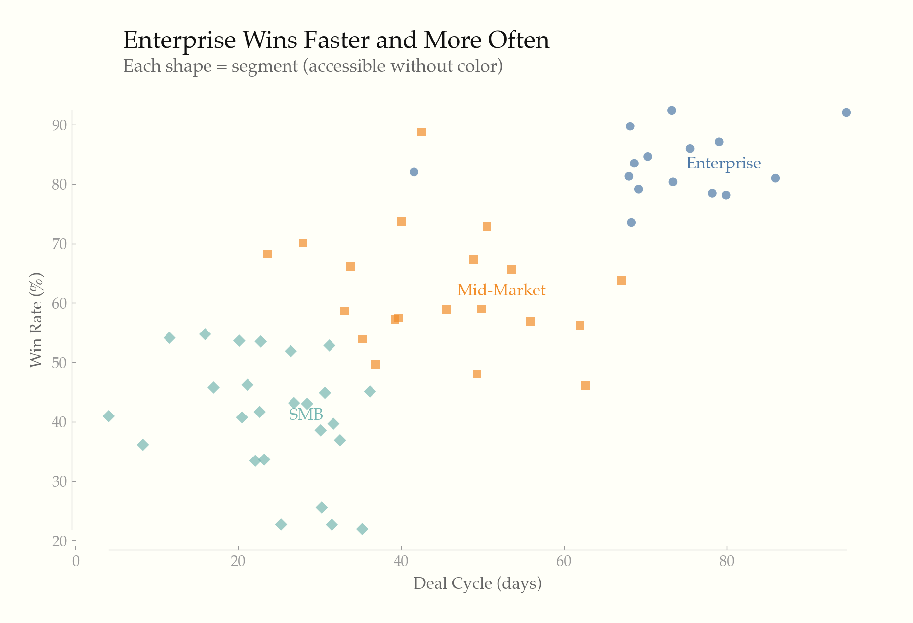
Accessible scatter — dual-encoded with shape + color
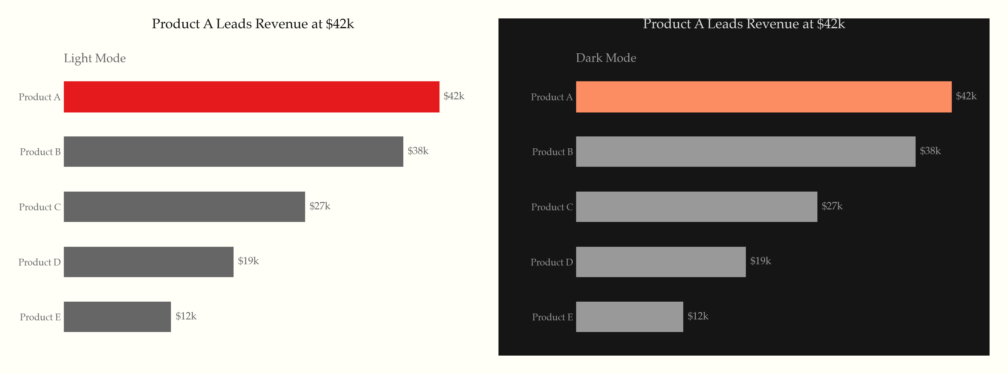
Light & dark — same chart, both themes
What it does
22 universal rules applied to every chart, organized in three tiers:
Static principles (rules 1–14) — the Tufte foundation:
- Maximize data-ink ratio — remove gridlines, borders, legends, and decoration that don't convey data
- Direct labeling, range-frame axes, no 3D, no pie charts (unless forced), no dual y-axes
- Serif typography, off-white backgrounds, gray as primary color with selective highlighting
- Annotate notable features, show comparison context, minimal tooltips
Screen-first principles (rules 15–19) — modern interactive contexts:
- Progressive disclosure (overview first, details on hover/tap/click)
- WCAG accessibility (contrast ratios, dual encoding, keyboard nav, screen reader text alternatives)
- Responsive design (fluid/adaptive strategies, touch targets, mobile-adapted chart types)
- Purposeful animation (data transitions only, respect
prefers-reduced-motion) - Intentional dark mode (semantic color tokens, never invert, reduce saturation)
Content & formatting (rules 20–22) — what Tufte assumed but never codified:
- Titles assert findings ("Revenue Surged 23%"), not axis descriptions
- Numbers formatted for humans ($1.2M, thousand separators, matched precision)
- Don't chart what a sentence or table can say better
Supported libraries
| Library | Rule file | Language |
|---|---|---|
| Recharts | rules/recharts.md |
React/JSX |
| ECharts | rules/echarts.md |
JavaScript |
| Chart.js | rules/chartjs.md |
JavaScript |
| matplotlib | rules/matplotlib.md |
Python |
| Plotly | rules/plotly.md |
Python/JS |
| D3.js / SVG / HTML | rules/svg-html.md |
Web |
Additional references
rules/interactive-and-accessible.md— progressive disclosure, accessibility, responsive, animation, dark moderules/typography-and-color.md— font stacks, palettes, hex valuesrules/anti-patterns.md— common violations and one-liner fixesrules/small-multiples-sparklines.md— small multiples, sparklines, slopegraphs
Based on
- The Visual Display of Quantitative Information (1983)
- Envisioning Information (1990)
- Visual Explanations (1997)
- Beautiful Evidence (2006)
License
MIT
No comments yet
Be the first to share your take.