
framesmith



An open-source MCP server that turns your AI coding agent into a capable UI designer. It gives the agent a visual canvas, a library of vetted design patterns, and a quality bar it must clear before showing you anything — so you review a real, non-slop design in the browser and agree on it before any framework code is written.
Contents: What it does · Capabilities · Viewer · Installation · Tools · Usage Example · Workflow · Development
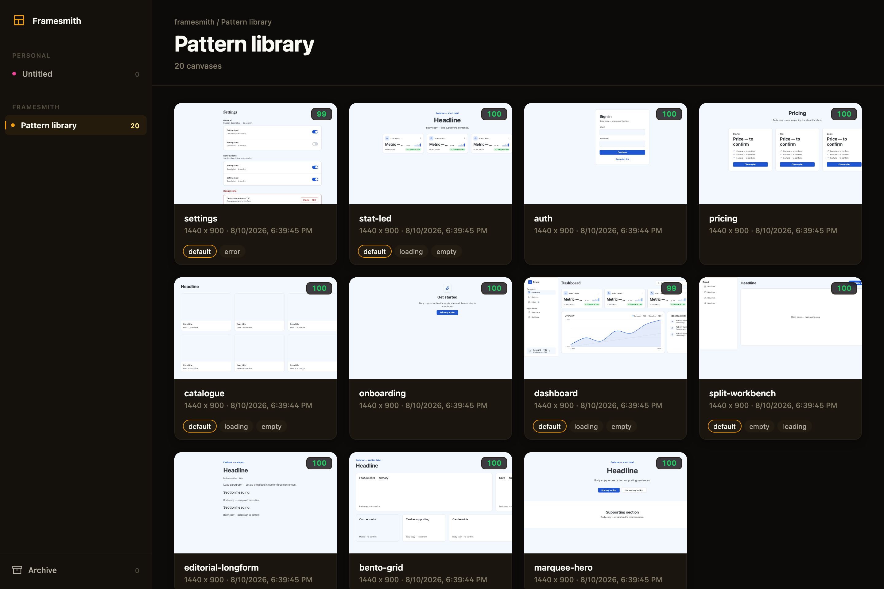
Above: the framesmith viewer, showing the built-in pattern library — 11 vetted page archetypes an agent starts from, each carrying its live quality score and its designed state variants. Workspaces and projects sit in the sidebar; you browse canvases like design files.
What an agent actually ships
Both screens below were built end-to-end by an agent with framesmith's own vocabulary — one generate_design_system call each (a seed color + a personality), stamped patterns, data-bound charts, and every quality gate cleared (score ≥ 95, states designed, stress-tested, both themes):
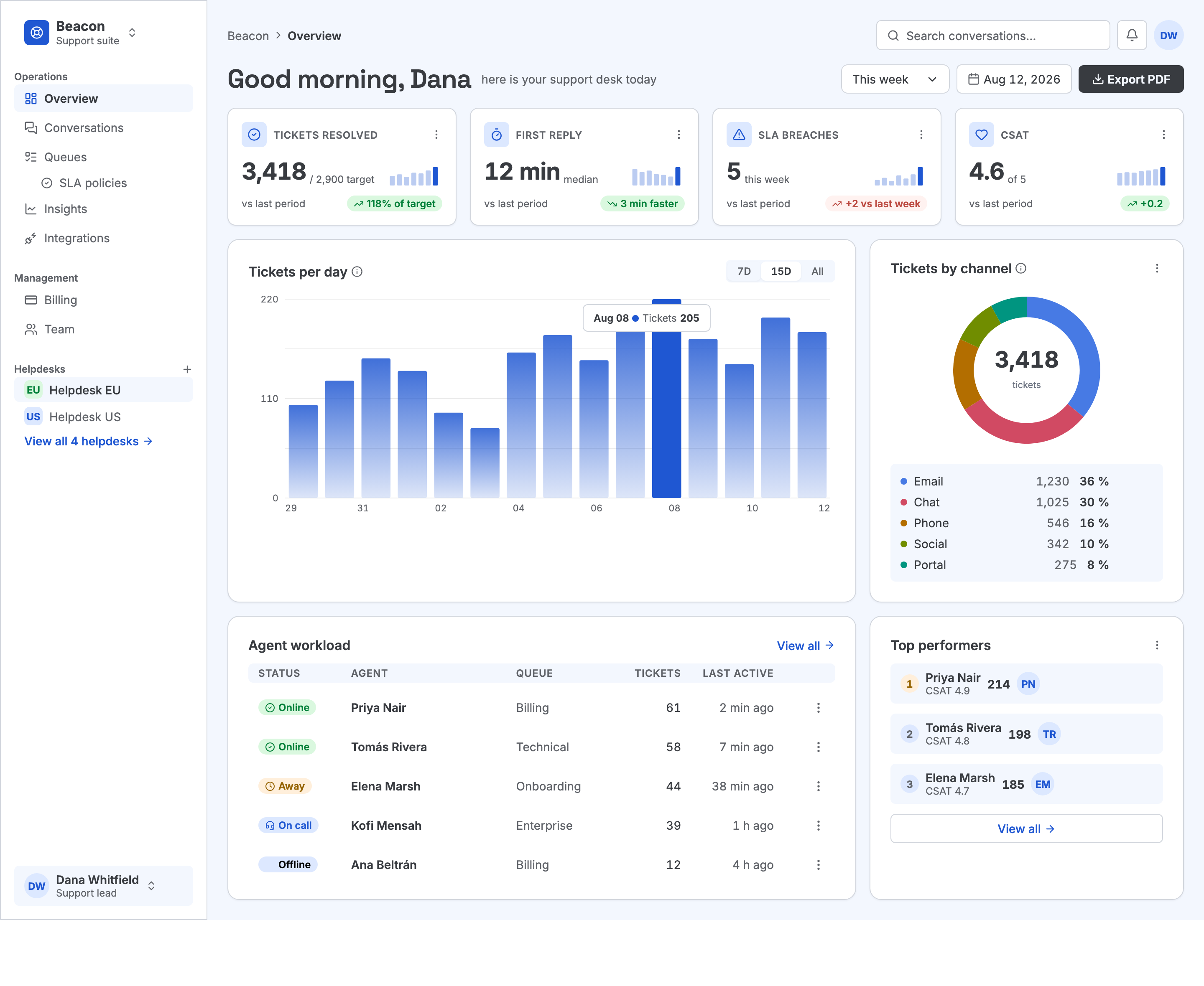
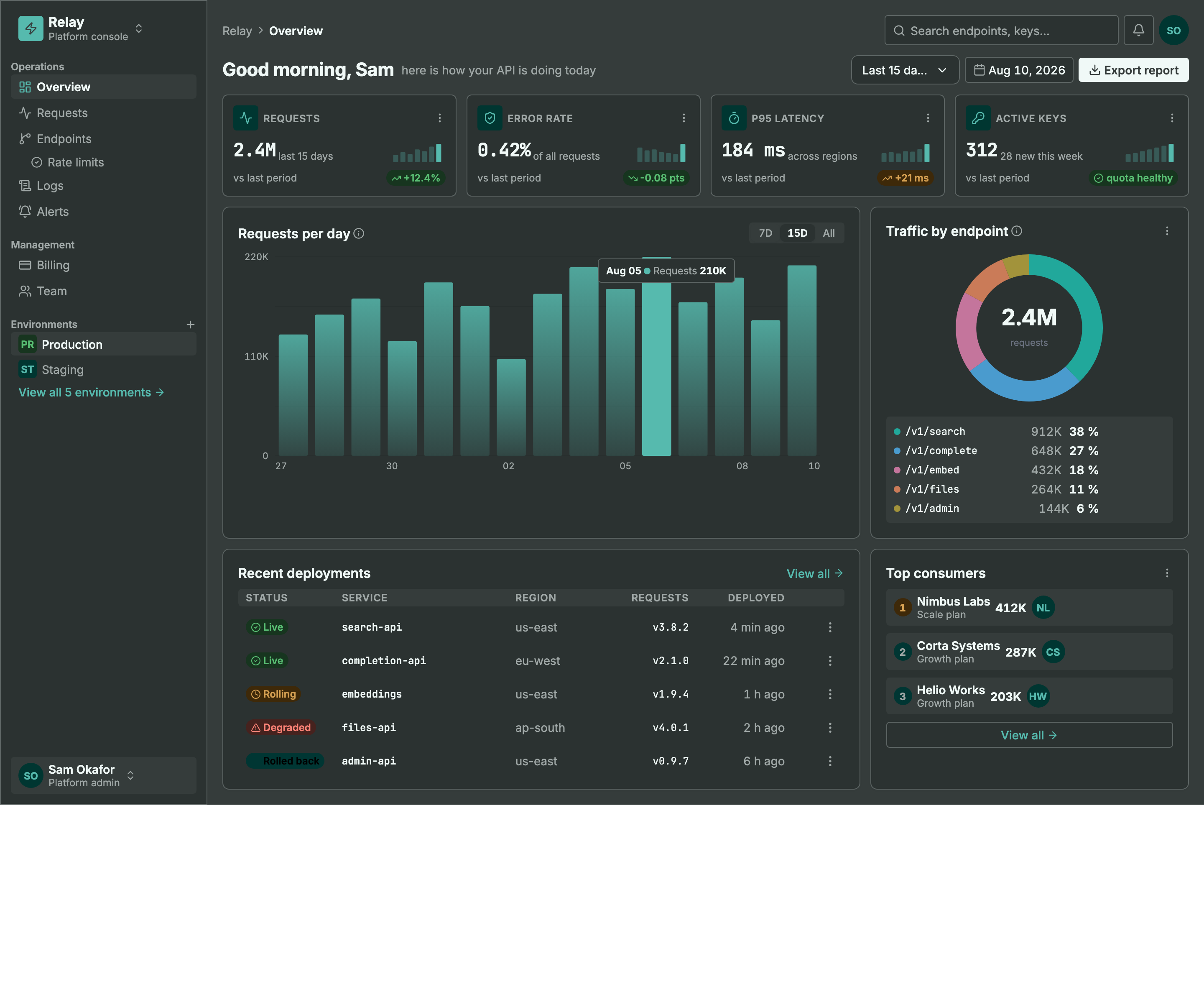
Same machinery, different seed + personality: a light ops dashboard and a dark API console. Every color pair is AA by construction, every chart is data-bound (edit a value, not an SVG path), and the dark theme is generated — not inverted.
MCP Client → stdio → framesmith server
↓
Scene Graph (in-memory JSON tree)
↓
HTML/CSS Renderer (inline styles)
↓
Puppeteer (headless Chromium → PNG)
What framesmith does
Left to itself, an AI agent tends to produce UI that looks AI-generated — generic spacing, no icons, a purple gradient by default, placeholder text that reads like placeholder text. framesmith closes that gap by moving design before code and holding it to a bar:
- Start from taste, not a blank canvas. The agent stamps one of 11 vetted page patterns (dashboard, auth, pricing, settings, onboarding, and more) — each regression-tested to score > 95 with zero cliché tells across every theme, and every structure (page and component alike) built entirely from type-role tokens so it re-voices under a generated design system instead of injecting stray pixel sizes, and hardened to survive hostile-length content (
canvas_stressCLEAN) — then adapts it. A blank canvas is where slop comes from; a pattern is a non-slop starting point. (list_structures/apply_structure) - Use the whole toolkit — like a real UI does. Real icons (Lucide + Material Symbols), fonts resolved by name, real input controls (
toggle/checkbox/radio/select), data-driven charts (line/bar/donut/sparkline, multi-series, bar emphasis), reusable components, and layered design tokens — never faked with Unicode glyphs, stray ellipses, or hand-drawn SVG paths standing in for a chart. - Evaluate, then self-correct.
canvas_evaluatescores the design across five craft categories plus a cliché-tell detector, a state-coverage check (a data screen without designed empty/loading states isn't done), and a usability layer (hit-target floor, label association, honest action copy), and returns aREADY/NOT READYdirective. The agent resolves every warning and tell and only presents once it'sREADY— polishing to the bar is the agent's job, not yours. - Review in the browser, own the output. You browse canvases like design files, with a live quality inspector and design-system panel. Designs persist as open JSON checked into your repo — no proprietary format, no lock-in — and can be re-imported from shipped HTML to keep the design honest.
Capabilities at a glance
| Area | What you get |
|---|---|
| Rendering | Scene graph → HTML/CSS → Puppeteer PNG · responsive breakpoints · real CSS grid (layout: "grid" + spans) for bento/editorial compositions · gradients, shadows, blur, glassmorphism · SVG paths · animations · data-driven charts (line/bar/donut/sparkline, multi-series, bar emphasis + in-SVG gradients) |
| Pattern library | 11 vetted page archetypes + 5 component scaffolds, all scoring > 95 with zero cliché tells, typography built from type-role tokens (not literal pixel sizes), and stress-hardened to survive hostile-length content; taxonomy axes + a diversification signal so successive screens vary |
| Quality & taste | canvas_evaluate (8 categories incl. cliché tells, state coverage + usability floors) with a READY/NOT READY directive · canvas_autofix (mechanical fixes) · optional vision-model rubric critique + canvas_revise · canvas_add_variant clones a screen into a linked empty/loading/error state · canvas_stress content-perturbation testing (long text, i18n, big numbers, empty/many rows) · project_evaluate rolls up a project's screens for cross-screen consistency (radius/accent drift, token adoption, hand-copied chrome, state coverage) plus an optional multi-screen flow critique — advisory, never a gate |
| Design systems | generate_design_system: one seed + one personality (technical / editorial / soft / data-dense) → the complete design language — colors, curated font pairing, typography roles, radius/density stances, $elevation depth tokens (dark-aware), $motion defaults · layered $tokens (workspace ▸ project ▸ canvas) · style presets · DESIGN.md import · generate_scale derives a modular type + spacing scale from a named ratio (optional fluid clamp() sizes) · generate_color_system turns one seed color into OKLCH ramps + AA-checked semantic tokens, a categorical chart palette, and a tint layer for chips/tiles/badges, dark theme included · dual-theme rendering + evaluation (theme: "dark" on screenshot/export, both-theme contrast in canvas_evaluate with APCA advisory) · token-detachment lint re-attaches literals that drift from a token |
| Primitives | Lucide + Material Symbols icons · Google Fonts by name · real form controls · components with instance overrides — create_component promotes existing work, copy_nodes carries subtrees (and their component defs) across canvases |
| Import from code | canvas_import_html / canvas_import_url — token-mapped, structure-reconstructed · canvas_sync_from_url pixel drift · canvas_check_drift structural drift · framesmith verify / check-drift CLI for CI/pre-commit gates, no MCP client needed |
| Viewer | Browser gallery + detail view · quality inspector (score, issues, click-to-highlight) · design-system token panel · point-and-tell feedback (Comment mode + Feedback tab) |
| Open by design | MIT · plain HTML/CSS · open JSON you own in your repo · content-hash versioning (canvas_version) so approvals reference an exact design, not just a name · works with any MCP-compatible client |
Viewer
Run npx -p framesmith framesmith-viewer to start the standalone browser viewer (default port 3001). Open any canvas to review it at multiple breakpoints, compare them side-by-side, inspect the underlying JSON, or archive / delete.
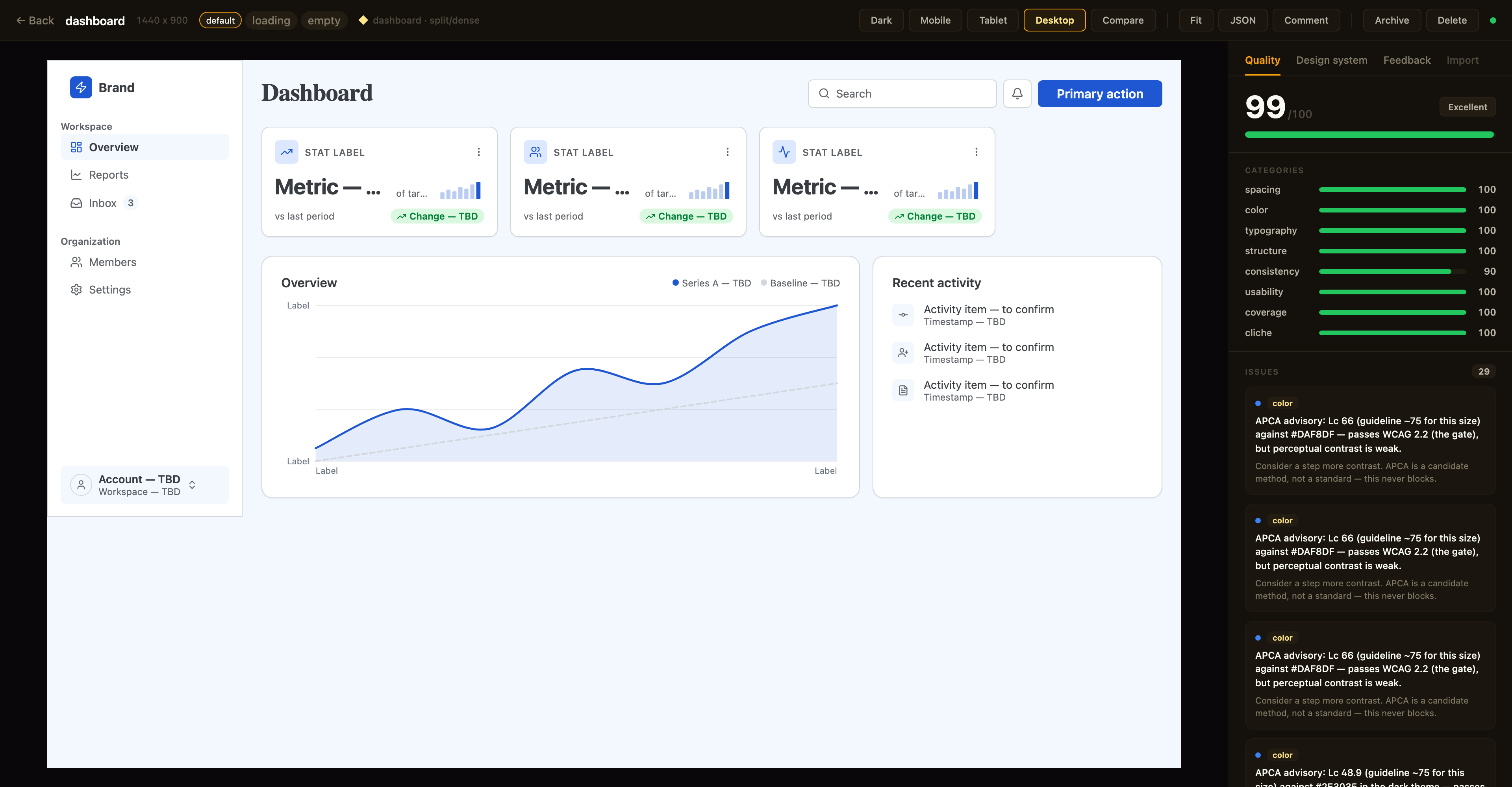
Above: a canvas in the detail view with the Quality inspector on the right — the same
canvas_evaluatescore the agent sees, with per-category bars and the issue list; the tabs along the top switch to the Design-system and Feedback panels. The toolbar exposes breakpoint previews, Compare, Fit, JSON, a Comment toggle for point-and-tell feedback, and lifecycle actions.
Quality panel. The canvas detail view shows a read-only quality inspector on the right: the heuristic canvas_evaluate score (0–100), per-category bars, and the issue list — each cliché tell with its category · tell badge, severity, and suggestion. Issues that canvas_autofix can resolve carry an auto-fixable tag, and clicking any issue highlights its node in the live preview. Every gallery card also shows a color-coded score badge so weak canvases stand out at a glance. The score matches what your agent sees over MCP (same fast-mode evaluation, genre-relaxed by the canvas's preset) — it's computed for display only and never written back.
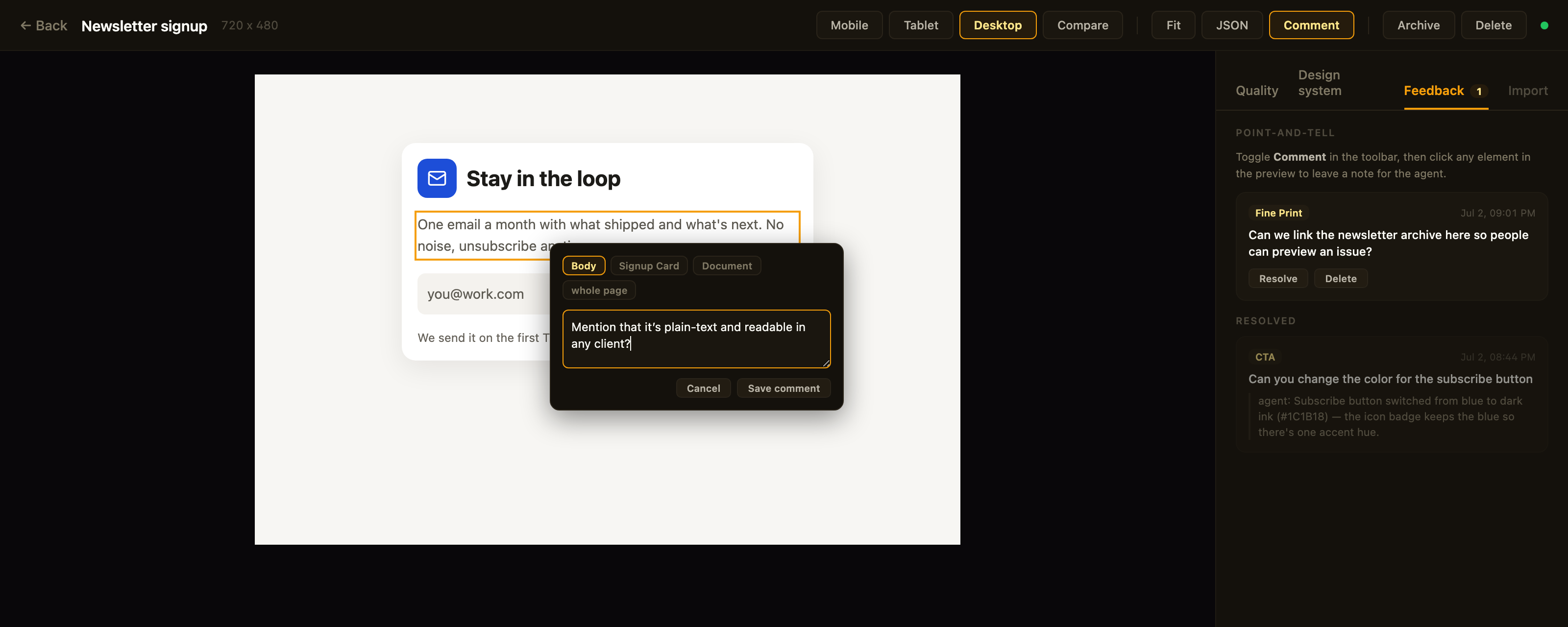
Above: point-and-tell in action — Comment mode is on, the clicked element is outlined, the popover's breadcrumb re-scopes the anchor, and the Feedback tab tracks open comments plus the agent's replies to resolved ones.
Feedback panel. Point-and-tell: toggle Comment in the toolbar and click any element in the preview to leave a note for the agent — a breadcrumb in the popover re-scopes the anchor from the exact element up to its card, section, or the whole page. The Feedback tab lists open comments (badge = open count) with click-to-highlight, lets you resolve or delete them, and shows the agent's resolution note as a reply once it has addressed the item. Comments persist on the canvas itself (metadata.feedback — git-diffable in bound repos) and the agent reads them over MCP via get_feedback; open feedback blocks the agent from presenting, same as open quality issues.
Design-system panel. A second inspector tab shows the canvas's effective design tokens — color swatches, type scale, spacing, and radius — resolved through the full workspace ▸ project ▸ canvas inheritance chain. Each section notes its dominant source layer, and any token resolving from a different layer is tagged (canvas / project / workspace) so you can see at a glance what a given canvas customized versus inherited.
Designs are authored through MCP tool calls from your AI assistant — in the viewer you review, comment, and manage lifecycle; you don't edit nodes. Files persist to ~/.framesmith/canvases/ so the viewer keeps showing them across sessions.
Installation
No clone or build needed — register framesmith with your MCP client via npx (requires Node 20+).
Claude Code
claude mcp add framesmith -- npx -y framesmith
Codex
Add to ~/.codex/config.toml:
[mcp_servers.framesmith]
command = "npx"
args = ["-y", "framesmith"]
Cursor
Add to ~/.cursor/mcp.json (or per-project .cursor/mcp.json):
{
  "mcpServers": {
    "framesmith": {
      "command": "npx",
      "args": ["-y", "framesmith"]
    }
  }
}
Windsurf
Add to ~/.codeium/windsurf/mcp_config.json:
{
  "mcpServers": {
    "framesmith": {
      "command": "npx",
      "args": ["-y", "framesmith"]
    }
  }
}
VS Code + MCP extension
Add to .vscode/mcp.json (project-scoped) or your global MCP settings:
{
  "servers": {
    "framesmith": {
      "command": "npx",
      "args": ["-y", "framesmith"]
    }
  }
}
Any other MCP-compatible client
framesmith speaks standard stdio MCP. Point your client at npx -y framesmith using whatever config shape your client expects.
Optional: set
FRAMESMITH_VIEWER_URL=http://localhost:3001in the MCP server env to pin it to a long-lived standalone viewer process — see Running the viewer.
Build from source (for development)
git clone https://github.com/vicmaster/framesmith.git
cd framesmith
npm install
npm run build
# then point your client at: node /path/to/framesmith/dist/index.js
Tools
init
One-call onboarding — the recommended first call each session, and safe to run repeatedly (idempotent). Binds the current repo if it isn't already (canvases become checked-in JSON under .framesmith/), ensures the convention projects exist, and returns the live state you need to start working.
| Param | Type | Description |
|---|---|---|
dir |
string? | Directory to bind / detect. Defaults to the nearest git repo root above the server working directory. |
workspaceName |
string? | Name for the workspace when binding fresh. Defaults to the repo folder name. |
projects |
string[]? | Projects to ensure exist (default: ["Foundations", "UI"]). Existing projects are never removed, so it's safe for adding feature/area projects like Onboarding. |
Returns the bound workspace + project IDs (binding re-keys IDs to repo-* — use the ones init returns), the on-disk layout, the workspace-layer token count, a workflow cheatsheet, the current gotchas, the framesmith://guidelines URI, and the viewer URL. If any canvas in the workspace has open point-and-tell comments, the result also carries openFeedback: { total, note } — a nudge to run get_feedback before doing anything else. It does not seed design tokens — set those at the workspace layer with workspace_set_design_system. The default Foundations project is just a canvas that visualizes the workspace tokens (which is where the design system actually lives).
canvas_create
Create a new canvas. If projectId is omitted, it lands in the built-in Untitled project of the Personal workspace.
| Param | Type | Description |
|---|---|---|
name |
string? | Canvas name |
projectId |
string? | Target project. Defaults to the built-in Untitled project. See project_list. |
The response also carries a diversification signal for the target project: the recently-built structures (newest first) and a hint to differ on at least one taxonomy axis, so successive canvases don't converge on the same layout. It's advisory — never blocking.
canvas_list
List canvases. Excludes archived canvases by default. A row carrying openFeedback: n has open point-and-tell comments waiting — read them with get_feedback before working on that canvas.
| Param | Type | Description |
|---|---|---|
projectId |
string? | Scope to one project |
includeArchived |
bool? | Include archived canvases (default false) |
Returns [{ id, name, createdAt, lastModified, versionHash, projectId, archived, openFeedback?, variant?, variants? }] — openFeedback (a count) is present only when > 0; versionHash is the design-content hash canvas_version checks approvals against. variant: { of, state } is present on a state-variant row; variants: [{ state, canvasId }] rolls the designed states onto a base row (see canvas_add_variant).
canvas_add_variant
Clone a screen into a linked state variant — the empty / loading / error version of a canvas, as its own sibling canvas. The clone gets re-keyed node IDs, the same project, copied tokens/components/fonts, and carries the provenance/genre stamp (feedback and critique stay behind); it's named <base> · <state> and linked via metadata.variant = { of, state }.
| Param | Type | Description |
|---|---|---|
canvasId |
string | The base canvas (a variant id also works — it resolves to the root base; variants never nest) |
state |
string | The state this variant designs — empty / loading / error recommended; free string accepted |
Returns { canvasId, name, state, of, idMap } — idMap maps every base node id to its clone, so follow-up edits target the right nodes immediately. One canvas per state per base (a duplicate state errors). The viewer shows a screen and its variants as one card with state chips; canvas_list rolls designed states onto the base row.
canvas_move / canvas_archive / canvas_unarchive / canvas_delete
Canvas lifecycle. canvas_move reassigns a canvas to a different project. canvas_archive sets a soft-delete flag (canvas stays on disk, hidden from default canvas_list); canvas_unarchive clears it. canvas_delete removes the canvas and its file permanently — irreversible.
viewer_url
Get the URL of the live viewer plus per-canvas URLs. Share these with the user so they can open the design in their browser. No params.
{
  "url": "http://localhost:3001",
  "gallery": "http://localhost:3001",
  "canvases": [
    { "name": "Login", "viewer": "http://localhost:3001/canvas/abc123" }
  ]
}
canvas_create already returns the per-canvas viewer URL in its response; reach for viewer_url when you want the gallery URL or to enumerate every existing canvas's URL in one call.
workspace_create / workspace_list / workspace_rename / workspace_delete
Top-level container CRUD. The built-in Personal workspace cannot be deleted, and workspace_delete refuses if the workspace still contains projects (move or delete them first).
project_create / project_list / project_rename / project_delete
Mid-level container CRUD inside a workspace. The built-in Untitled project cannot be deleted. project_delete refuses if the project still contains any canvases (archived ones still count — move or delete them first).
canvas_bind
Bind a workspace to the current project directory so its canvases live in the repo as open JSON — a .framesmith/ directory checked in alongside the code, instead of the global ~/.framesmith store. Run it once per repo.
| Param | Type | Description |
|---|---|---|
workspaceId |
string? | Workspace whose projects + canvases migrate into the repo. Defaults to the built-in Personal workspace. |
dir |
string? | Directory to bind. Defaults to the nearest git repo root above the server's working directory. |
It creates .framesmith/workspace.json (the binding plus the design system, so a fresh clone resolves tokens identically) and one subdirectory per project holding one slug-named file per canvas:
.framesmith/
  workspace.json     # workspace + projects[] + design system
  design-system/
    design-tokens.json
  ui/
    bloom-landing.json
    login-form.json
It migrates the workspace's projects + canvases in and makes the repo the source of truth for the rest of the session. A canvas is either repo-bound or global, never both. Afterwards the server auto-detects .framesmith/ on startup (walking up from its working directory). Commit .framesmith/ so designs travel with the code and diff cleanly in review.
The bind also records the repo in ~/.framesmith/registry.json, so the standalone viewer shows bound repos alongside your global workspaces in one gallery (it rebuilds that read-only mirror on launch and whenever the registry changes).
batch_design
Execute operations on the scene graph. Operations are line-separated strings:
# Insert a frame into the document root
header=I("document", { type: "frame", layout: "horizontal", fill: "#1a1a2e", padding: 24, gap: 16, width: 1440, height: 80 })

# Insert text into the header
I(header, { type: "text", content: "My App", fontSize: 24, fontWeight: 700, color: "#ffffff" })

# Update a node
U("nodeId", { fill: "#e94560" })

# Delete a node
D("nodeId")

# Copy a node to a new parent
copy=C("sourceId", "parentId", { fill: "#0f3460" })

# Move a node
M("nodeId", "newParentId", 0)

# Replace a node entirely
R("nodeId", { type: "text", content: "Replaced" })
Returns { ok, nodeIds, results }. nodeIds maps each bound variable to the node ID it created — e.g. { "header": "n_a1b2" } — so you can target those nodes in later calls (bindings only live within a single call). results lists each op's outcome in order. If the call wrote a fontFamily nothing can serve yet (not cached, registered, or system/generic), a Font warnings content item names it — a cache-only check with no network call, so it's a heads-up, not exhaustive.
Node types: frame, text, rectangle, ellipse, image, icon, path, component, instance, toggle, checkbox, radio, select, chart, skeleton (loading-placeholder block — token-derived neutral fill; pulses subtly in the live viewer, always static in screenshots/exports so diffs stay deterministic; pulse: false opts a block out)
Properties: fill, gradient, stroke, strokeWidth, strokeStyle, borderTop, borderRight, borderBottom, borderLeft, cornerRadius, width, height, minWidth, minHeight, maxWidth, layout ("horizontal" | "vertical" | "grid"), gap, rowGap, gridColumns, gridColumn, gridRow, padding, alignItems, justifyContent, fontSize, fontFamily, fontWeight, color, content, textAlign, lineHeight, letterSpacing (px), textDecoration, textTransform, textOverflow ("ellipsis" — designed single-line truncation; canvas_stress reports clips behind it as info), tabularNums, fontVariationSettings, src, objectFit, opacity, shadow (CSS string, or "$elevation.<name>" referencing an elevation token), shadows, blur, backdropBlur, backdropFilter, overflow, wrap, position, x, y, icon, iconSize, iconColor, iconStyle, checked, disabled, value, d, viewBox, strokeLinecap, strokeLinejoin, strokeDasharray, animation, transition (object, or "$motion.<name>" referencing a motion token), kind, series, segments, innerRatio, centerValue, centerLabel, sparkKind, xDomain, yDomain, curve, gridlines, xLabels, yLabels, componentId, overrides
Use textTransform: "uppercase" for uppercase labels (don't bake casing into content), letterSpacing for tracking, and fontVariationSettings (e.g. '"wght" 650') for variable-font axes.
minHeight is the vertical analog of minWidth: a floor, not a cap. Prefer it over a fixed height on any node whose content can grow (a card, a table row) — it holds the design's rest-state rhythm while still letting the box expand under hostile-length content instead of clipping. See Width strategies for the same idea applied on the horizontal axis.
Charts are data-driven — the chart node does the value→coordinate math:
I(panel, { type: "chart", kind: "line", width: 600, height: 220, curve: "smooth", gridlines: 4,
  series: [
    { data: [210, 450, 648, 903, 1133, 1338, 1518], stroke: "$accent", strokeWidth: 2.5, area: true },   // actual
    { data: [225, 450, 675, 900, 1125, 1350, 1575, 1800, 2025, 2250, 2475, 2700], stroke: "$border", strokeDasharray: "6 4" }  // target
  ],
  xLabels: ["Jan", "", "", "", "", "", "", "", "", "", "", "Dec"] })
Phase 28 adds the dashboard kinds. A donut is data-bound segments plus a center figure — the legend stays your composition:
I(panel, { type: "chart", kind: "donut", width: 176, height: 176, centerValue: "1,204", centerLabel: "forms",
  segments: [
    { value: 385, color: "$chart-1", label: "North" },
    { value: 289, color: "$chart-2", label: "Highlands" },
    { value: 217, color: "$chart-3", label: "River delta" }
  ] })
A bar chart with a selected day is highlight: [11] on the series (selected bar solid, the rest muted; barGradient: true fades the muted bars inside the SVG, invisible to the gradient-overuse tell). A sparkline is kind: "sparkline" — axis-free, latest point emphasized by default, sized for a KPI card corner. segments[].color and series stroke both take $chart-1…$chart-6 refs.
Multi-series in one node; x positions are data indexes (a shorter series stops early against a longer one — booked months vs a full-year target); xDomain/yDomain default from the data (bars floor at 0); kind: "bar" renders grouped bars from the same series model. Dash the projected series, solid the actuals. Editing one value is a one-prop edit — never hand-compute path d strings for a chart.
Borders: stroke + strokeWidth draw all four sides (strokeStyle: "dashed" | "dotted" for forecast/placeholder outlines); per-side borders take an object — borderTop: { width: 1, color: "$border", style? } for table row rules, borderLeft: { width: 3, color: "$primary" } for accent edges. Paths dash via strokeDasharray: "6 4" (or [6, 4]).
Grid: layout: "grid" + gridColumns (a count → equal columns; an array of fr weights / CSS lengths like [2, 1, "240px"]; or a raw template string) gives real CSS grid for bento/editorial compositions that flex can only approximate. Children place with gridColumn / gridRow — a number means "span N", strings accept "span 2" or "1 / 3". gap covers both axes, rowGap overrides the row axis; responsive: "stack" collapses the grid to one column on mobile with spans reset. Tracks render as minmax(0, Nfr) so long content can't blow a column past its share. Unsafe gridColumns/gridColumn/gridRow values never reach the DOM — they fall back to equal columns / are dropped.
find_nodes
Find nodes by what they are — property values, text content, or name — instead of hand-tracking ids. Read-only; the query twin of replace_matching_properties.
| Param | Type | Description |
|---|---|---|
canvasId |
string | Canvas ID |
match |
object? | Property/value predicate, AND across keys — e.g. { "fontSize": 30 } (token refs match literally, structured values by shape) |
text |
string? | Case-insensitive substring match on text content — e.g. "$1.52M" |
name |
string? | Exact match on the node name — e.g. "YearTable" |
scope |
string? | Node ID — limit the search to this subtree (inclusive) |
type |
string? | Only match nodes of this type (text, frame, …) |
All provided filters AND together (at least one is required). Returns { count, matches } where each match is { id, type, name?, path } — path is the named ancestor chain ("Document / Table / Row 2 / text"), so you can tell which match you want before editing it.
replace_matching_properties
Bulk property edit: find every node whose properties equal all the match entries and apply the set properties to each — one call instead of one U() op per node.
| Param | Type | Description |
|---|---|---|
canvasId |
string | Canvas ID |
match |
object | Property/value predicate, AND across keys — e.g. { "width": 110 } or { "fill": "$secondary-container" } (token refs match literally; structured values like shadows match by shape) |
set |
object | Properties to write on every matched node — e.g. { "width": "100%" }. Can't change id/type |
scope |
string? | Node ID — limit matching to this subtree (inclusive). Default: whole document |
type |
string? | Only match nodes of this type (text, frame, …) |
dryRun |
bool? | Preview the matched nodes + count without writing |
Returns { ok, count, matches, dryRun? } where matches is [{ id, type, name? }]; dryRun: true is present only on preview calls. Preview with dryRun: true before wide matches — a value like width: 150 can match more nodes than intended.
create_component
Promote an existing subtree to a reusable component — the subtree moves into the canvas's component registry and an instance node takes its place, render-identical. Answers the evaluator's "no component instances found" advisory with a one-call action.
| Param | Type | Description |
|---|---|---|
canvasId |
string | Canvas ID |
nodeId |
string | Root of the subtree to promote (not the document root, not an existing instance) |
name |
string? | Component name (default: the node's name, then type); seeds the componentId slug |
Returns { componentId, instanceId, name, overridableChildren } — overridableChildren lists the named descendants that instance overrides can target (overrides match children by name). Stamp more copies via batch_design: I("parent", { type: "instance", componentId, overrides: { "Title": { content: "…" } } }).
copy_nodes
Copy subtrees from one canvas into another (or duplicate within one) — the cross-canvas reuse C() can't do. Component definitions referenced by the copied trees travel along automatically.
| Param | Type | Description |
|---|---|---|
fromCanvasId |
string | Source canvas |
nodeIds |
string[] | Roots of the subtrees to copy |
toCanvasId |
string | Target canvas (may equal the source to duplicate) |
parentId |
string? | Target parent (default: the target document root) |
index |
number? | Insert position (default: append) |
Returns { ok, copied, idMap, rootIds, copiedComponents } — idMap maps every source node id to its new id; a componentId collision with a different def re-keys the incoming def and remaps the copied instances.
screenshot
Render canvas to PNG (returned as base64 image).
| Param | Type | Description |
|---|---|---|
canvasId |
string | Canvas ID |
nodeId |
string? | Specific node to capture |
width |
number? | Viewport width (default 1440) |
height |
number? | Viewport height (default 900) |
scale |
number? | Device scale (default 2) |
theme |
string? | "dark" renders the design system's dark token layer (dark.colors/dark.elevation overrides); default light — a no-op without a dark layer |
read_nodes
Read node data from the scene graph. Already know the id(s)? This is the tool. If you don't — you're hunting for a node by what's on it — use find_nodes instead of eyeballing this tree.
| Param | Type | Description |
|---|---|---|
canvasId |
string | Canvas ID |
nodeIds |
string[]? | Node IDs to read (default: root) |
maxDepth |
number? | Max traversal depth (default 5) |
snapshot_layout
Get computed bounding boxes via browser rendering.
| Param | Type | Description |
|---|---|---|
canvasId |
string | Canvas ID |
nodeId |
string? | Root node to start from |
maxDepth |
number? | Max depth (default 10) |
Returns { nodeId, x, y, width, height, children? } per node — plus, on any node whose content exceeds its box, overflow data (scrollWidth/clientWidth/scrollHeight/clientHeight and an ellipsis flag for designed truncation): the same capture canvas_stress uses to detect clipping.
generate_scale
Derive, don't hand-pick: a named ratio + a base size → a full modular type scale (text-xs … text-3xl typography tokens) and a paired space scale (space-3xs … space-3xl, md = 1× base), written to the workspace / project / canvas token layer of your choice. Craft defaults are baked into every step — line-height bands (1.5 body / 1.35 subhead / 1.2 display) and negative display tracking — so the tracking advisory and the type-scale ratio check are satisfied by construction (generated sizes are declared as tokens, which pins them). Usage-dependent typography checks — measure, unique-size count, tabular numerals — still depend on how you apply the scale.
| Param | Type | Description |
|---|---|---|
ratio |
string | number | minor-second (1.125), major-second (1.2), minor-third (1.25), major-third (1.333), perfect-fourth (1.5), golden (1.618) — or a number in (1, 2.2] |
baseSize |
number? | Body size the scale pivots on (default 16) |
stepsDown / stepsUp |
number? | Steps below/above base (defaults 2 / 4) |
fluid |
object? | { minViewport?, maxViewport? } — emit Utopia-style clamp() type sizes interpolating from ~85% at the small viewport to full size at the large (space stays static by design) |
canvasId / projectId / workspaceId |
string? | Exactly one — the token layer written to |
Returns the generated tokens plus overwrote (existing names replaced). Reference results as fontSize: "$text-lg" (the full token spec applies through the ref) and gap: "$space-md". Fluid clamp() sizes render as-is and are exempt from the numeric scale checks.
generate_design_system
The headline call for a new project's look: one seed color + one personality → the complete design language, deterministic, no API key. It composes generate_color_system and generate_scale, then adds everything those engines have no opinion about:
- A curated font pairing, loaded through the font pipeline so the first screenshot renders real faces —
technical= Space Grotesk + Inter,editorial= Fraunces + Source Sans 3,soft= Plus Jakarta Sans + Inter,data-dense= Inter + a JetBrains Monofiguresrole. - Typography roles the structures speak —
$display,$heading,$title(page/screen titles — one step below$display),$text-lg/$text-sm(untracked in-between sizes for card titles, nav, prose, and metadata),$body,$label,$caption(+$figureswith a mono face) — with per-role weight and tracking, alongside thetext-xs…text-3xlsteps.$labelis the one tracked role (it carriesletterSpacing), so structures reserve it for genuine control/CTA/table-header labels and use$text-smfor ordinary prose — labeling prose as$labelreads as a section eyebrow to the cliché census. - A radius stance (
radius-sm/md/lg— e.g. 6/10/14 fortechnical, 12/16/20 forsoft) and a density stance (the space scale pivots on the personality). chart-1…chart-6— a categorical series palette hue-walked from the seed (≥ 30° apart, purple band avoided unless the seed itself is purple, each ≥ 3:1 on both themes' surfaces per WCAG 1.4.11) for chart segments, series, and legend dots. Near-neutral seeds anchor at a stable blue and say so in the result (rangeNote).accent-tint/success-tint/warning-tint/danger-tint/neutral-tint— the tint layer: soft same-hue surfaces for status chips, icon tiles, pill badges, and initials avatars. One pairing rule: tint as the fill, base color as the ink (fill: "$success-tint"+color: "$success") — AA by construction, dark layer included.$elevation.flat/raised/floating/overlay— layered soft shadow tokens referenced from any node asshadow: "$elevation.raised". The dark layer re-states each depth (stronger black ink) so elevation reads on dark surfaces instead of vanishing.$motiondefaults (fast/base/slow) tuned to the personality's temperament.
| Param | Type | Description |
|---|---|---|
seed |
string | The brand color everything derives from (#RRGGBB) |
personality |
string | Required — technical, editorial, soft, or data-dense. Dashboards → data-dense/technical, marketing/content → editorial, consumer → soft |
baseSize / ratio |
number? | Override the personality's type pivot / scale ratio |
canvasId / projectId / workspaceId |
string? | Exactly one — the token layer written to |
preserveInherited |
boolean? | Canvas scope only. Default true — see "Inherited tokens" below. Pass false to write the generated language whole. |
Same seed, different personality = a visibly different product. The two single-purpose generators below stay for targeted regeneration (just the palette, just the scale).
Inherited tokens (canvas scope). A token the canvas already resolves through an inherited workspace/project design system is kept instead of silently overwritten, and reported back so you can act on it rather than guess:
preservedFromDesignSystem— ordinary preserved tokens. For typography, preservation is field-wise: an inherited token that's only partially specified (e.g.{ fontSize: 13 }) is merged with the generated role rather than shadowing it whole, so the personality'sfontFamily/fontWeight/trackingstill land; the entry'sfilledFromPresetnames which fields the preset contributed. A fully-specified inherited token is preserved as-is.designSystemConflicts— preservations that land on a token in the semantic vocabulary this call itself defines (bg-surface,text-primary,border,accent, and the type roles). Keeping an inherited value there means two design languages on one screen — e.g. a near-blackbordersurviving onto a freshly generated light-green system. Each entry addswhyandfix.- Pass
preserveInherited: falseto skip all of this and write the generated language whole (the right call when this canvas should be the new system, not a blend of two). The response'stypographyRolesalways reports what the canvas actually resolves, which differs from the generated values exactly when preservation fired.
Same contract, same field names, as apply_preset and generate_color_system.
generate_color_system
One seed color → a full perceptual color system, written to the workspace / project / canvas token layer of your choice:
primary-50…primary-900— an OKLCH ramp with perceptually even lightness steps and chroma tapered at the extremes; out-of-gamut colors clip toward lower chroma, never hue-shift. (The hand-rolled conversions are validated against Chrome's ownoklch()parsing.)neutral-50…neutral-900—
No comments yet
Be the first to share your take.